
// // Button groups // -------------------------------------------------- // Make the div behave like a button .btn-group, .btn-group-vertical { position: relative; display: inline-block; vertical-align: middle; // match .btn alignment given font-size hack above > .btn { position: relative; float: left; // Bring the "active" button to the front &:hover, &:focus, &:active, &.active { z-index: 2; } &:focus { // Remove focus outline when dropdown JS adds it after closing the menu outline: 0; } } } // Prevent double borders when buttons are next to each other .btn-group { .btn + .btn, .btn + .btn-group, .btn-group + .btn, .btn-group + .btn-group { margin-left: -1px; } } // Optional: Group multiple button groups together for a toolbar .btn-toolbar { margin-left: -5px; // Offset the first child's margin &:extend(.clearfix all); .btn-group, .input-group { float: left; } > .btn, > .btn-group, > .input-group { margin-left: 5px; } } .btn-group > .btn:not(:first-child):not(:last-child):not(.dropdown-toggle) { border-radius: 0; } // Set corners individual because sometimes a single button can be in a .btn-group and we need :first-child and :last-child to both match .btn-group > .btn:first-child { margin-left: 0; &:not(:last-child):not(.dropdown-toggle) { .border-right-radius(0); } } // Need .dropdown-toggle since :last-child doesn't apply given a .dropdown-menu immediately after it .btn-group > .btn:last-child:not(:first-child), .btn-group > .dropdown-toggle:not(:first-child) { .border-left-radius(0); } // Custom edits for including btn-groups within btn-groups (useful for including dropdown buttons within a btn-group) .btn-group > .btn-group { float: left; } .btn-group > .btn-group:not(:first-child):not(:last-child) > .btn { border-radius: 0; } .btn-group > .btn-group:first-child { > .btn:last-child, > .dropdown-toggle { .border-right-radius(0); } } .btn-group > .btn-group:last-child > .btn:first-child { .border-left-radius(0); } // On active and open, don't show outline .btn-group .dropdown-toggle:active, .btn-group.open .dropdown-toggle { outline: 0; } // Sizing // // Remix the default button sizing classes into new ones for easier manipulation. .btn-group-xs > .btn { &:extend(.btn-xs); } .btn-group-sm > .btn { &:extend(.btn-sm); } .btn-group-lg > .btn { &:extend(.btn-lg); } // Split button dropdowns // ---------------------- // Give the line between buttons some depth .btn-group > .btn + .dropdown-toggle { padding-left: 8px; padding-right: 8px; } .btn-group > .btn-lg + .dropdown-toggle { padding-left: 12px; padding-right: 12px; } // The clickable button for toggling the menu // Remove the gradient and set the same inset shadow as the :active state .btn-group.open .dropdown-toggle { .box-shadow(inset 0 3px 5px rgba(0,0,0,.125)); // Show no shadow for `.btn-link` since it has no other button styles. &.btn-link { .box-shadow(none); } } // Reposition the caret .btn .caret { margin-left: 0; } // Carets in other button sizes .btn-lg .caret { border-width: @caret-width-large @caret-width-large 0; border-bottom-width: 0; } // Upside down carets for .dropup .dropup .btn-lg .caret { border-width: 0 @caret-width-large @caret-width-large; } // Vertical button groups // ---------------------- .btn-group-vertical { > .btn, > .btn-group, > .btn-group > .btn { display: block; float: none; width: 100%; max-width: 100%; } // Clear floats so dropdown menus can be properly placed > .btn-group { &:extend(.clearfix all); > .btn { float: none; } } > .btn + .btn, > .btn + .btn-group, > .btn-group + .btn, > .btn-group + .btn-group { margin-top: -1px; margin-left: 0; } } .btn-group-vertical > .btn { &:not(:first-child):not(:last-child) { border-radius: 0; } &:first-child:not(:last-child) { border-top-right-radius: @border-radius-base; .border-bottom-radius(0); } &:last-child:not(:first-child) { border-bottom-left-radius: @border-radius-base; .border-top-radius(0); } } .btn-group-vertical > .btn-group:not(:first-child):not(:last-child) > .btn { border-radius: 0; } .btn-group-vertical > .btn-group:first-child:not(:last-child) { > .btn:last-child, > .dropdown-toggle { .border-bottom-radius(0); } } .btn-group-vertical > .btn-group:last-child:not(:first-child) > .btn:first-child { .border-top-radius(0); } // Justified button groups // ---------------------- .btn-group-justified { display: table; width: 100%; table-layout: fixed; border-collapse: separate; > .btn, > .btn-group { float: none; display: table-cell; width: 1%; } > .btn-group .btn { width: 100%; } > .btn-group .dropdown-menu { left: auto; } } // Checkbox and radio options // // In order to support the browser's form validation feedback, powered by the // `required` attribute, we have to "hide" the inputs via `opacity`. We cannot // use `display: none;` or `visibility: hidden;` as that also hides the popover. // This way, we ensure a DOM element is visible to position the popover from. // // See https://github.com/twbs/bootstrap/pull/12794 for more. [data-toggle="buttons"] > .btn > input[type="radio"], [data-toggle="buttons"] > .btn > input[type="checkbox"] { position: absolute; z-index: -1; .opacity(0); } {"translation-revision-date":"2025-01-09T15:10:54+00:00","generator":"WP-CLI\/2.12.0","source":"src\/Components\/Dashboard\/TemplateSection.js","domain":"messages","locale_data":{"messages":{"":{"domain":"messages","lang":"en","plural-forms":"nplurals=2; plural=(n != 1);"},"Build Websites 10x Faster with Templates":["Construisez des sites web 10 fois plus vite avec des mod\u00e8les"],"Choose from our professionally designed websites to build your site faster, with easy customization options.":["Choisissez parmi nos sites web con\u00e7us par des professionnels pour construire votre site plus rapidement, avec des options de personnalisation faciles."],"View Templates":["Voir les mod\u00e8les"]}}} Eventer News – thechocolatefactorybytasneem.com
CART

No products in the cart.

Harmonia’s Prestigious Excellence Award!

Sometimes I’ll have sections that I’m not quite sure how they fit in the puzzle of a tune, they’ll get moved around; what I think was originally a verse ends…


Harmonia’s Melodic Marvel!

Alienum phaedrum torquatos nec eu, vis detraxit periculis ex, nihil expetendis in mei. Mei an pericula euripidis, hinc partem ei est. Eos ei nisl graecis, vix aperiri consequat an. Eius…
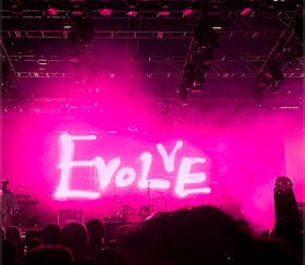
Harmonia’s Prestigious Excellence Award!

Celebrating a remarkable achievement, Harmonia Music Festival has been honored. The world of live events is buzzing with excitement as we prepare to unveil the lineup for our highly anticipated…