
// // Button groups // -------------------------------------------------- // Make the div behave like a button .btn-group, .btn-group-vertical { position: relative; display: inline-block; vertical-align: middle; // match .btn alignment given font-size hack above > .btn { position: relative; float: left; // Bring the "active" button to the front &:hover, &:focus, &:active, &.active { z-index: 2; } &:focus { // Remove focus outline when dropdown JS adds it after closing the menu outline: 0; } } } // Prevent double borders when buttons are next to each other .btn-group { .btn + .btn, .btn + .btn-group, .btn-group + .btn, .btn-group + .btn-group { margin-left: -1px; } } // Optional: Group multiple button groups together for a toolbar .btn-toolbar { margin-left: -5px; // Offset the first child's margin &:extend(.clearfix all); .btn-group, .input-group { float: left; } > .btn, > .btn-group, > .input-group { margin-left: 5px; } } .btn-group > .btn:not(:first-child):not(:last-child):not(.dropdown-toggle) { border-radius: 0; } // Set corners individual because sometimes a single button can be in a .btn-group and we need :first-child and :last-child to both match .btn-group > .btn:first-child { margin-left: 0; &:not(:last-child):not(.dropdown-toggle) { .border-right-radius(0); } } // Need .dropdown-toggle since :last-child doesn't apply given a .dropdown-menu immediately after it .btn-group > .btn:last-child:not(:first-child), .btn-group > .dropdown-toggle:not(:first-child) { .border-left-radius(0); } // Custom edits for including btn-groups within btn-groups (useful for including dropdown buttons within a btn-group) .btn-group > .btn-group { float: left; } .btn-group > .btn-group:not(:first-child):not(:last-child) > .btn { border-radius: 0; } .btn-group > .btn-group:first-child { > .btn:last-child, > .dropdown-toggle { .border-right-radius(0); } } .btn-group > .btn-group:last-child > .btn:first-child { .border-left-radius(0); } // On active and open, don't show outline .btn-group .dropdown-toggle:active, .btn-group.open .dropdown-toggle { outline: 0; } // Sizing // // Remix the default button sizing classes into new ones for easier manipulation. .btn-group-xs > .btn { &:extend(.btn-xs); } .btn-group-sm > .btn { &:extend(.btn-sm); } .btn-group-lg > .btn { &:extend(.btn-lg); } // Split button dropdowns // ---------------------- // Give the line between buttons some depth .btn-group > .btn + .dropdown-toggle { padding-left: 8px; padding-right: 8px; } .btn-group > .btn-lg + .dropdown-toggle { padding-left: 12px; padding-right: 12px; } // The clickable button for toggling the menu // Remove the gradient and set the same inset shadow as the :active state .btn-group.open .dropdown-toggle { .box-shadow(inset 0 3px 5px rgba(0,0,0,.125)); // Show no shadow for `.btn-link` since it has no other button styles. &.btn-link { .box-shadow(none); } } // Reposition the caret .btn .caret { margin-left: 0; } // Carets in other button sizes .btn-lg .caret { border-width: @caret-width-large @caret-width-large 0; border-bottom-width: 0; } // Upside down carets for .dropup .dropup .btn-lg .caret { border-width: 0 @caret-width-large @caret-width-large; } // Vertical button groups // ---------------------- .btn-group-vertical { > .btn, > .btn-group, > .btn-group > .btn { display: block; float: none; width: 100%; max-width: 100%; } // Clear floats so dropdown menus can be properly placed > .btn-group { &:extend(.clearfix all); > .btn { float: none; } } > .btn + .btn, > .btn + .btn-group, > .btn-group + .btn, > .btn-group + .btn-group { margin-top: -1px; margin-left: 0; } } .btn-group-vertical > .btn { &:not(:first-child):not(:last-child) { border-radius: 0; } &:first-child:not(:last-child) { border-top-right-radius: @border-radius-base; .border-bottom-radius(0); } &:last-child:not(:first-child) { border-bottom-left-radius: @border-radius-base; .border-top-radius(0); } } .btn-group-vertical > .btn-group:not(:first-child):not(:last-child) > .btn { border-radius: 0; } .btn-group-vertical > .btn-group:first-child:not(:last-child) { > .btn:last-child, > .dropdown-toggle { .border-bottom-radius(0); } } .btn-group-vertical > .btn-group:last-child:not(:first-child) > .btn:first-child { .border-top-radius(0); } // Justified button groups // ---------------------- .btn-group-justified { display: table; width: 100%; table-layout: fixed; border-collapse: separate; > .btn, > .btn-group { float: none; display: table-cell; width: 1%; } > .btn-group .btn { width: 100%; } > .btn-group .dropdown-menu { left: auto; } } // Checkbox and radio options // // In order to support the browser's form validation feedback, powered by the // `required` attribute, we have to "hide" the inputs via `opacity`. We cannot // use `display: none;` or `visibility: hidden;` as that also hides the popover. // This way, we ensure a DOM element is visible to position the popover from. // // See https://github.com/twbs/bootstrap/pull/12794 for more. [data-toggle="buttons"] > .btn > input[type="radio"], [data-toggle="buttons"] > .btn > input[type="checkbox"] { position: absolute; z-index: -1; .opacity(0); } {"translation-revision-date":"2025-01-09T15:10:54+00:00","generator":"WP-CLI\/2.12.0","source":"src\/Components\/Dashboard\/TemplateSection.js","domain":"messages","locale_data":{"messages":{"":{"domain":"messages","lang":"en","plural-forms":"nplurals=2; plural=(n != 1);"},"Build Websites 10x Faster with Templates":["Construisez des sites web 10 fois plus vite avec des mod\u00e8les"],"Choose from our professionally designed websites to build your site faster, with easy customization options.":["Choisissez parmi nos sites web con\u00e7us par des professionnels pour construire votre site plus rapidement, avec des options de personnalisation faciles."],"View Templates":["Voir les mod\u00e8les"]}}} thechocolatefactorybytasneem.com
Hero LG thumbilna
Hero SM thumbnail

Layered Luxury Dessert Bars Eggless

If you've ever wanted to create luxurious, indulgent dessert bars at home, this is your chance! Join us for a live online masterclass where you’ll learn to craft egg-free, gelatin-free layered bars in rich global flavours — from rose pistachio to matcha, saffron, kunafa and more. Perfectly balanced in texture and taste, each bar is dipped, drizzled, and designed to impress.

JULY AT 11:30 AM

7+

Item Recipes

Workshop

What Do
You Learn?

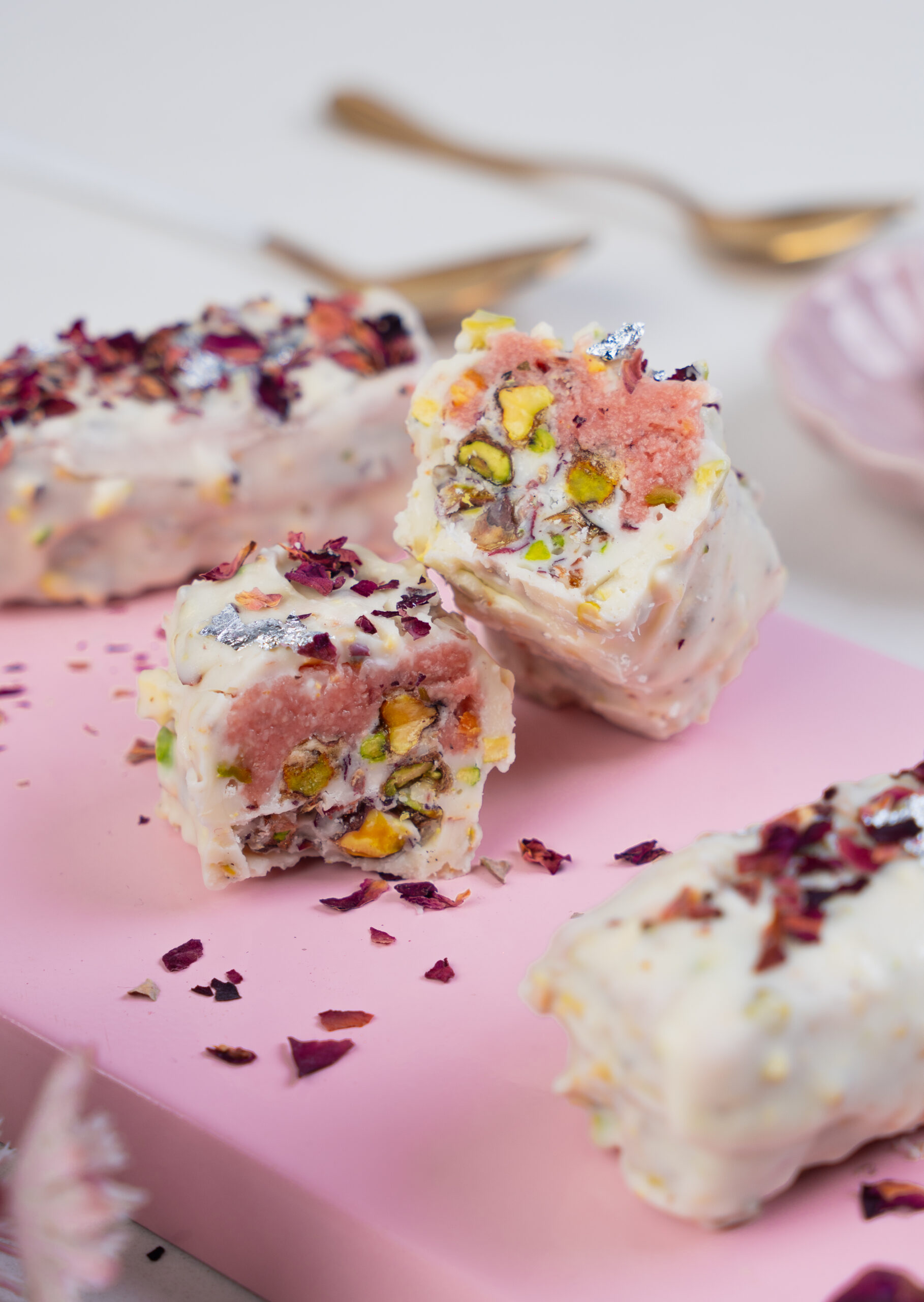
Rose Persian Bars

Rose flavoured marzipan on a layer of caramelized chocolate pistachio dipped in nutty white chocolate glaze.

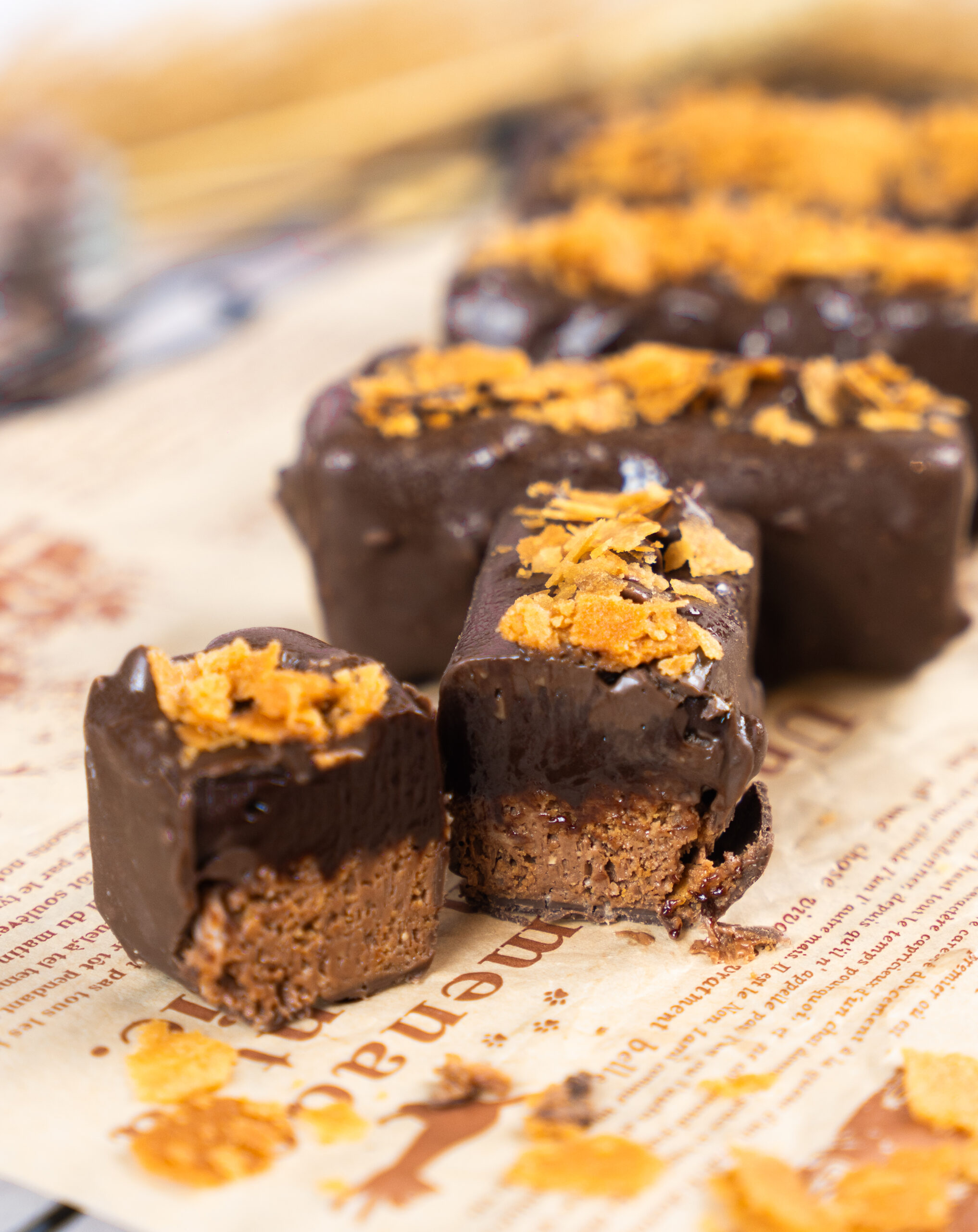
Nama Crunchy Bars

Gooey nama chocolate layered on a homemade wafer crunch base dipped in dark nutty glaze.
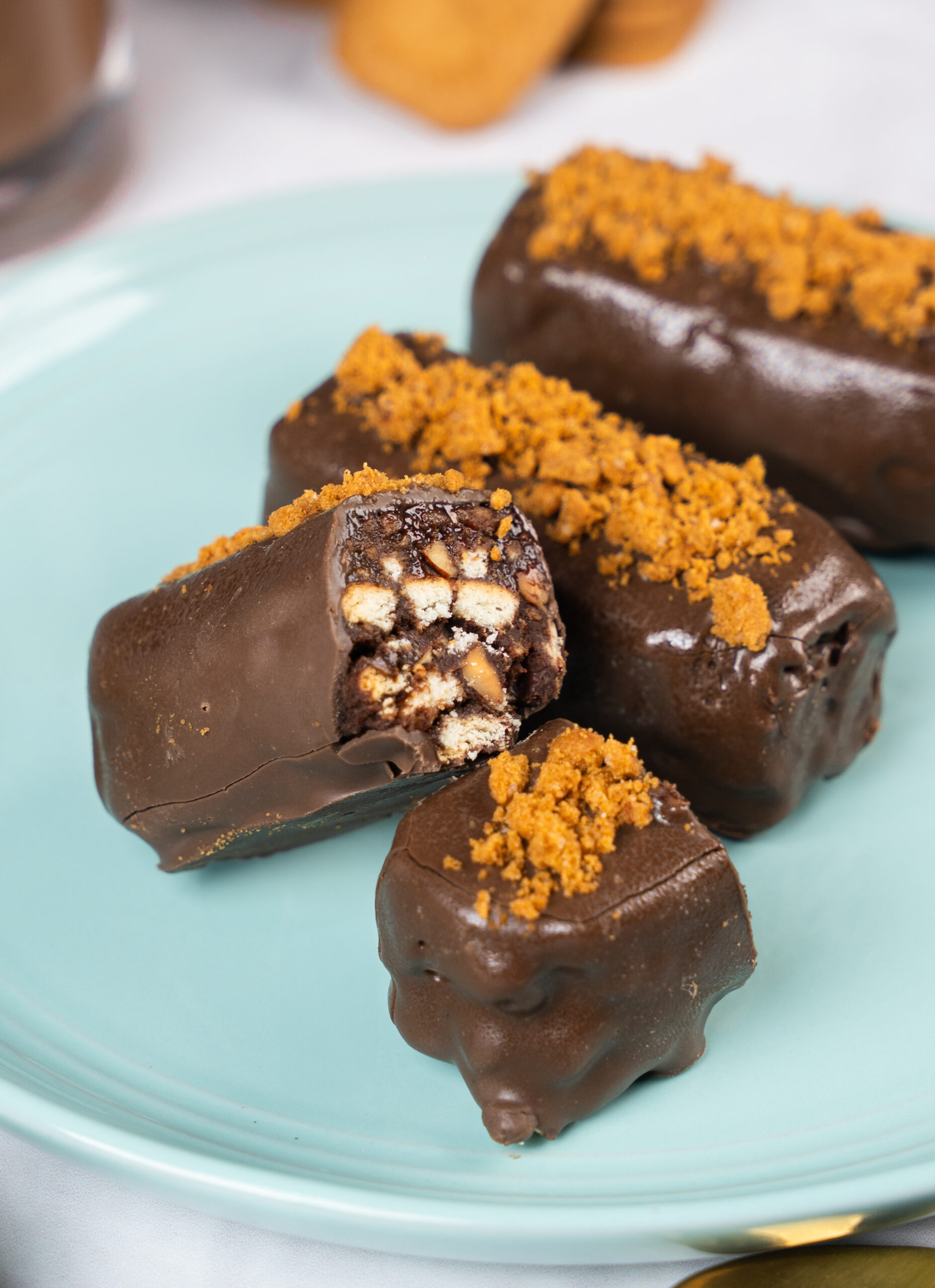
Chunky Cookie bars

Fudgy dark chocolate and cookies bar dipped in dark chocolate.
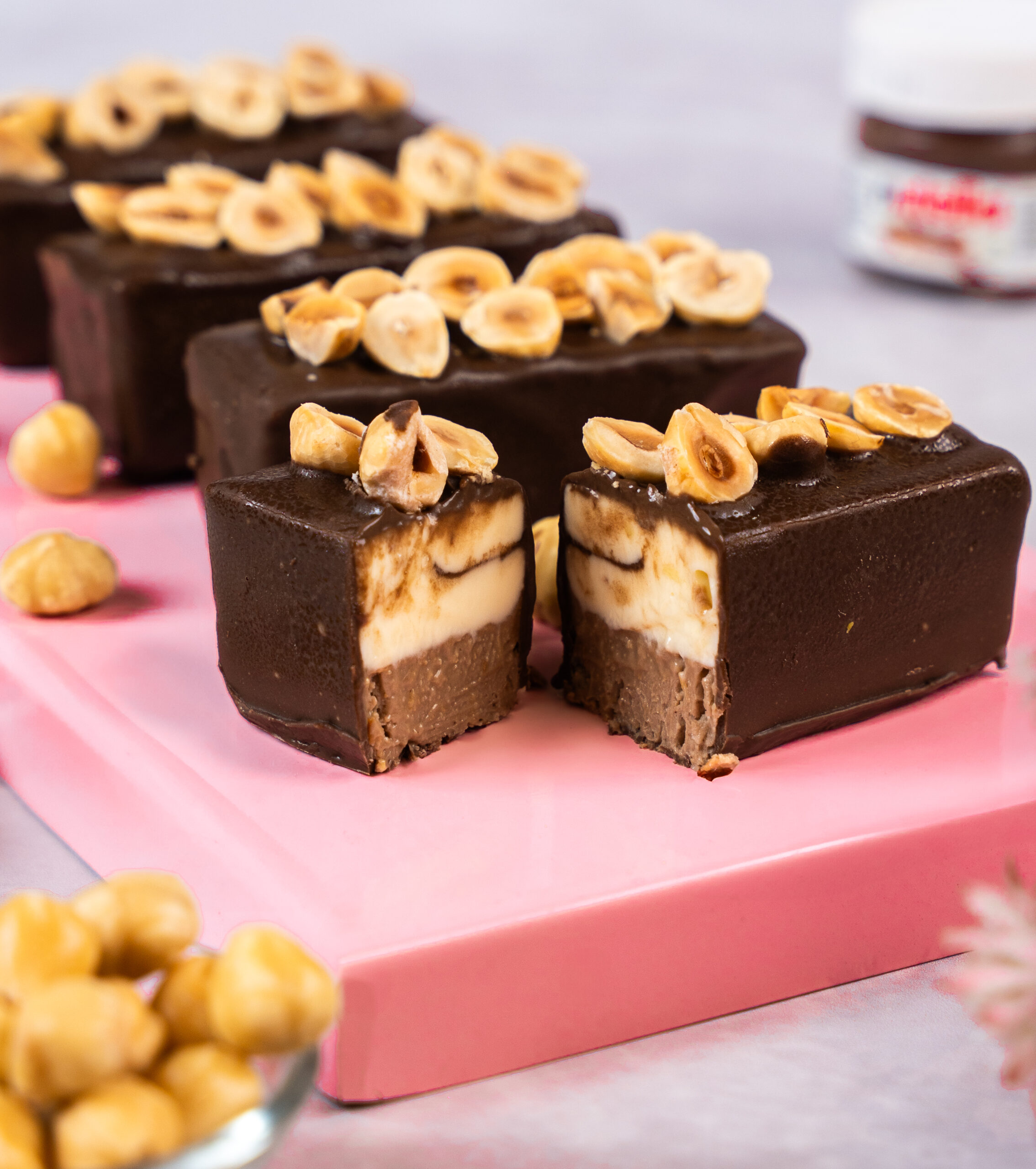
Nutty Kunafa Kinder Bars

Crunchy Hazelnut Kunafa topped with gooey kinder chocolate layer dipped in dark chocolate.
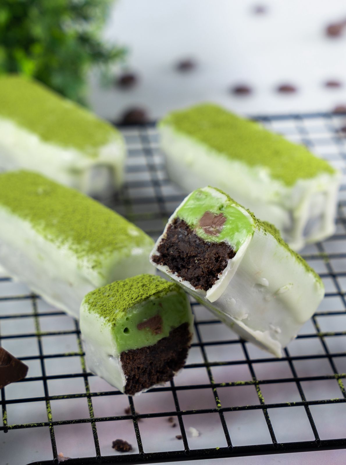
Matcha Luxe Bars

Crunchy Oreo flavoured base layered with gooey matcha nama chocolate dipped in white chocolate.
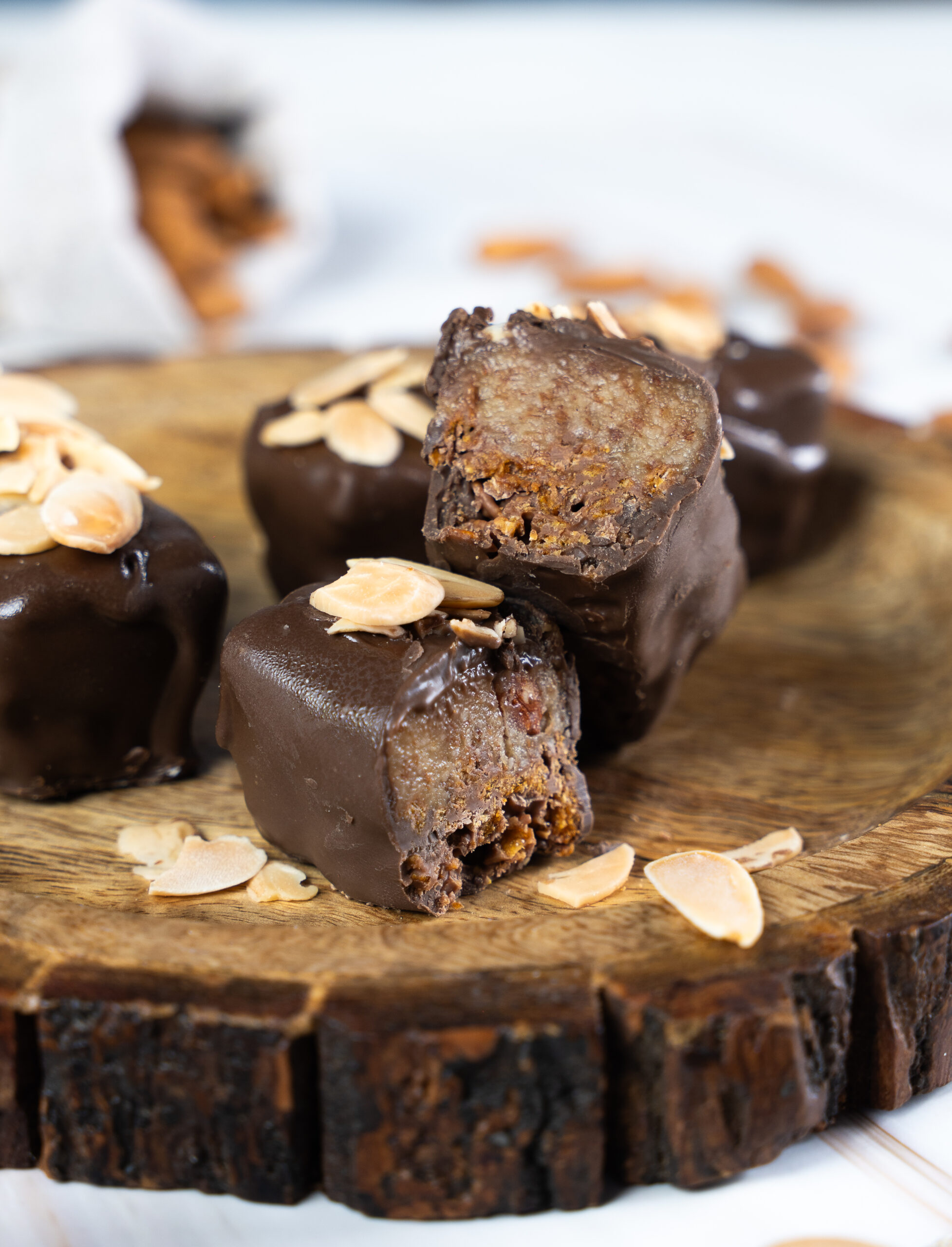
Golden Almond bar

Layer of caramelized chocolatey cornflakes topped with almond frangipane filled dipped in dark chocolate.
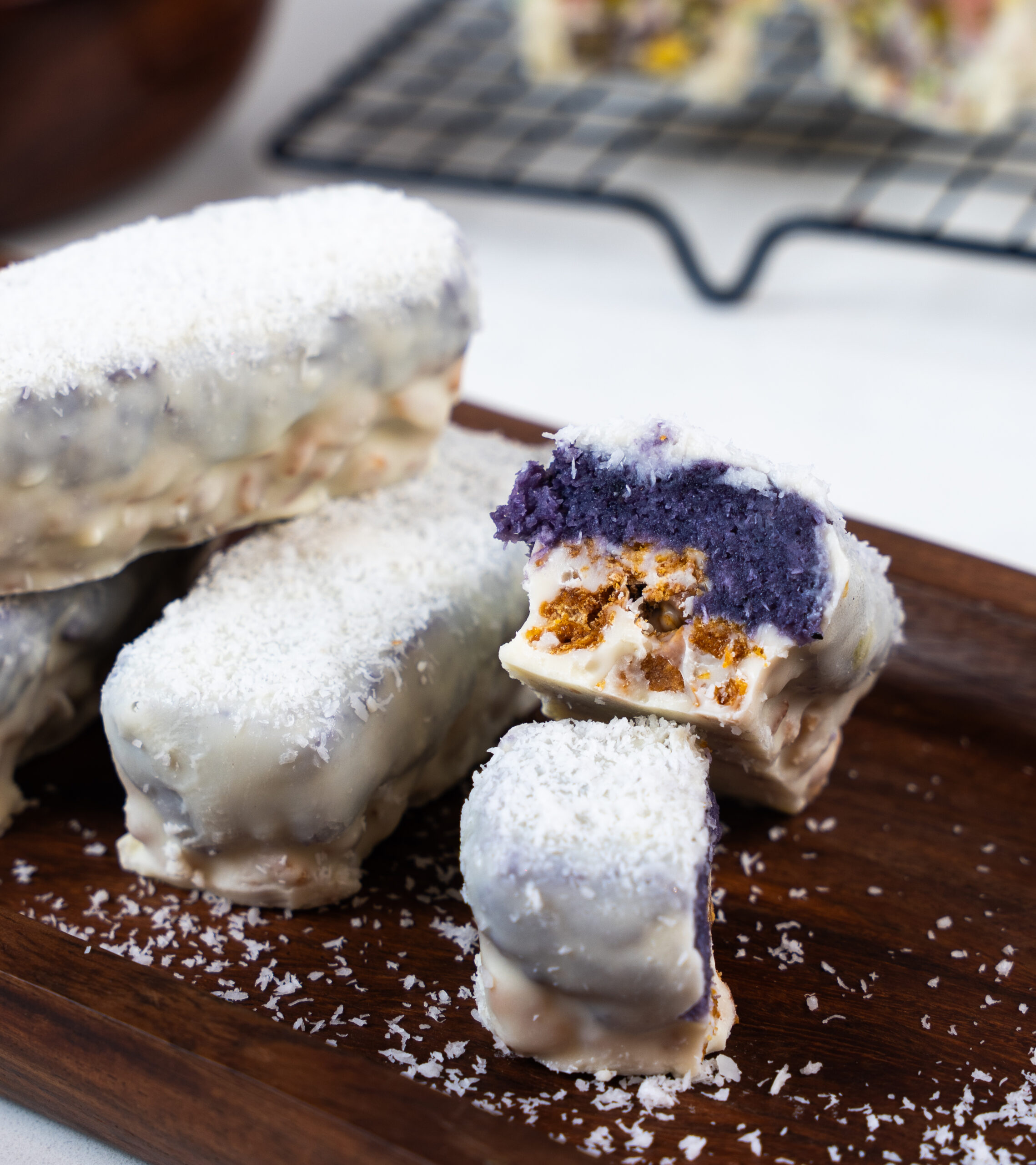
Blue Bounty Bars

Coconut & berry flavoured Bounty bar layered on a crunchy cornflaky caramely base dipped in white chocolate glaze.
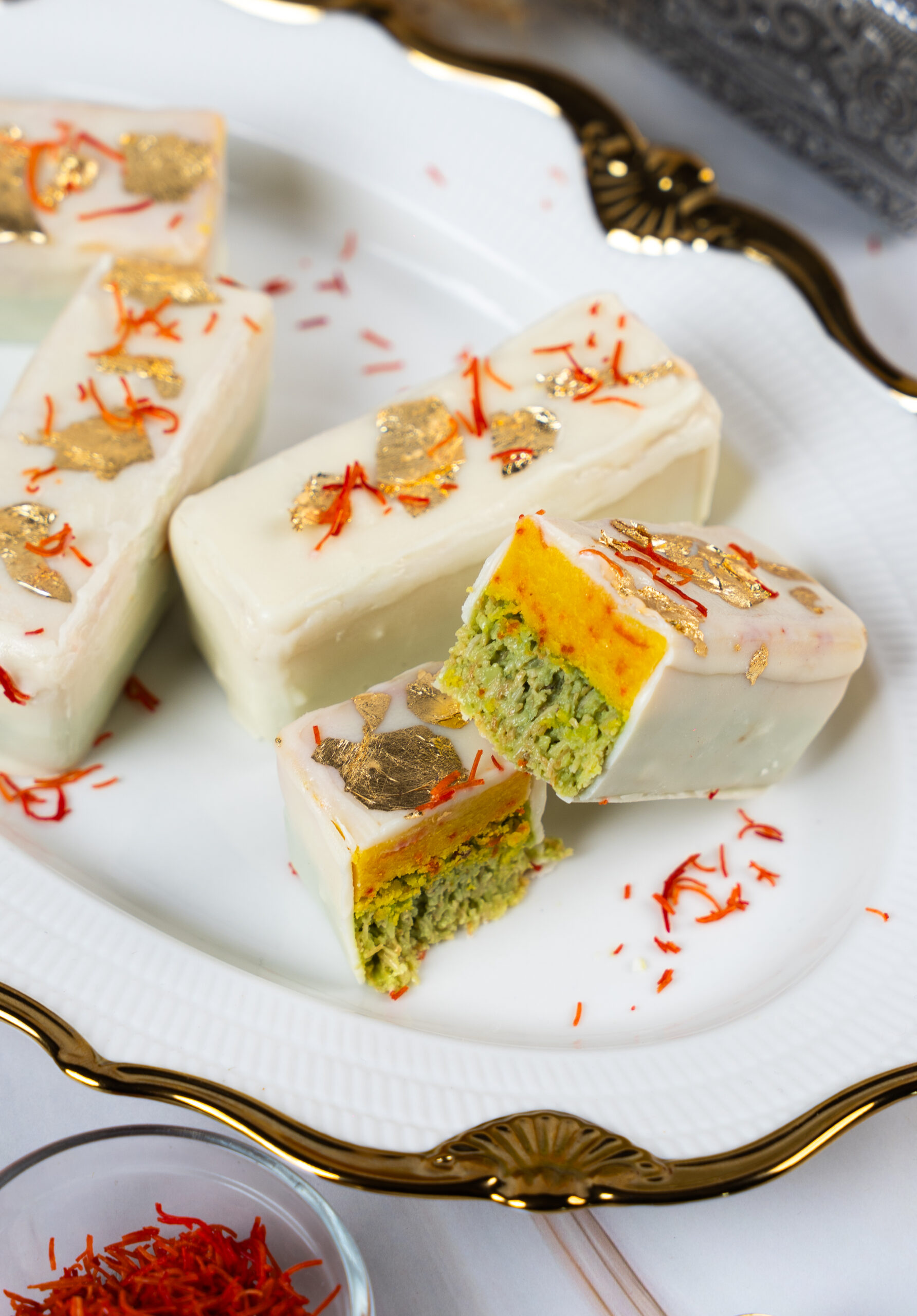
Royal Zafran Bars

Delicious fusion flavours of kesar mawa fudge on a crunchy pistachio Kunafa layer dipped in white chocolate.
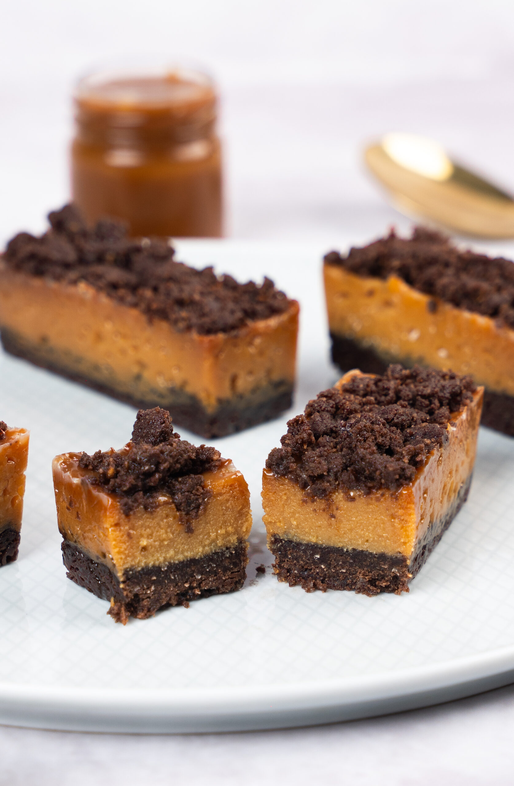
Caramel Crumble bar

Buttery chocolate shortbread base layered with chewy candied caramel topped with crunchy cookie crumble.

Book Now

Layered Luxury Dessert Bars

http://Guest%20Alt%20Text http://Guest%20Alt%20Text http://Guest%20Alt%20Text

+ Attending

Secure Your Spot Now

http://Guest%20Alt%20Text http://Guest%20Alt%20Text http://Guest%20Alt%20Text

+ Seats Available

Attending

Solutions for Your Curiosities

FAQ's

All recipes are eggfree and gelatin free

All ingredients are easily available locally

We will be sharing a list of vendors

⁠The doughnut or bombolini dough can be made using a stand mixer or can be kneaded by hand too

Shadow